PUBLIC FORUMS/GENERAL FORUM

Topic Title: Update 2: Redesign again (Announcement Topic)

Topic starter: Iiridayn Donator

Topic started: 18:02:05 21st Jan 2022

Posts: 15 Last post: 11:19:42 22nd Oct 2022 by DAngel

Previous 1 2  Next

Iiridayn Donator Posted: 18:02:05 21st Jan 2022

Posts: 1612

Topics: 91

Location: United States

Gender: Male


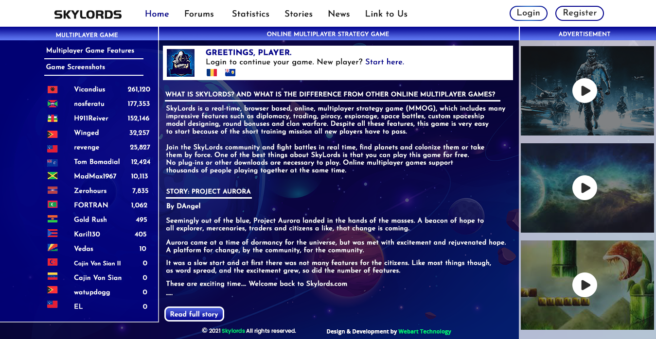
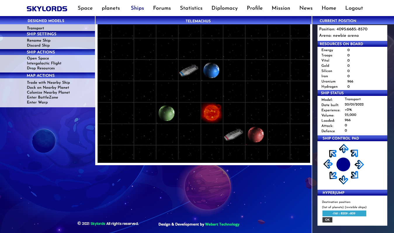
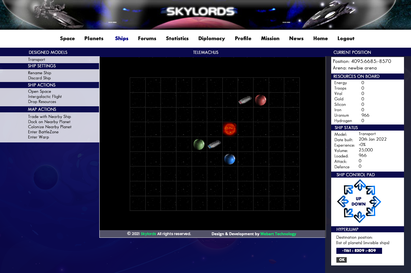
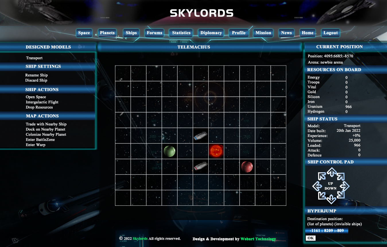
I took a deal on a redesign from a cold caller, as the price seemed pretty reasonable and worth the risk. I feel it's important to update our design before doing much advertising, so the game looks modern. We have three pages and no limit to revisions.

The below files are the first revision:


So far consensus in the discord has been that the blue is certainly not dark enough.

Personally I'm not a huge fan of the font either. I feel the header redesign isn't bad though, but don't like the bubbly buttons. I feel a non-tiled background is probably important, and think the translucent overlay look works pretty well with it.

Any additional feedback I should give the designer on Monday to produce a second revision? Any disagreements?

Not updating the design is on the table, but I'd like to come up with something we all like, or not update at all, if possible.


__________________________
SkyLords Head Programmer

Spelled: I I R I (not irii, irri, or iri).

Force of nature.

Winged Shadow Posted: 22:59:25 21st Jan 2022

Posts: 226

Topics: 16

Location: United States

Gender: Male


I am definitely going to have to agree on the blue. For some reason it does seem a bit off to me. Maybe a darker color will help that.

Overall, it isn't bad. There are a couple things: the header with the nav buttons I am not a fan of and the name seems generic.

On the space page that they sent, will it just be the 7 squares, or will it be closer to what we have now? (I think it is about 10 or so). Also, on the date built timestamp, can we have that set up to be like it is currently (9th Sep 20**)? I know it can get confusing otherwise for those that don't use that standard like in the US. Finally, on the hyperjump coords input box, they should be able to make it bigger. Seems like small number for such a big box.

On the planet resource allocation page, definitely making sure that they either put in lines around the resources like now or using slightly different shades between the resources is definitely a must.


__________________________
Immortality will come to such as are fit for it.-Dark Viper
Better to reign in hell, than serve in heaven.
LTC worlds taken:20 and counting

zyx planet Hi DaC has been captured by Winged Shadow, ChaosInDaGalaxy.

Iiridayn Donator Posted: 23:04:41 21st Jan 2022

Posts: 1612

Topics: 91

Location: United States

Gender: Male


Ah, I'd not noticed that - yeah, they probably cut it off at the edges deliberately to suggest there's more... I could compromise there by adding another square all around and cutting them off. Not sure if I should load content for them though. The space page is currently 11x9 (just rewrote it, so fresh in my brain - let me know if there are any new bugs as a result -_-; )

Yes, timestamps should remain in a reasonable format - I'll bring that up with the designer as well.

Yep, lost some important context on the resources page; I'll bring up striped or lined rows.


__________________________
SkyLords Head Programmer

Spelled: I I R I (not irii, irri, or iri).

Force of nature.

Tom Bomadial Posted: 17:27:06 22nd Jan 2022

Posts: 423

Topics: 76

Location: United States

Gender: Male


My problem exists with the space grid. But that is being addressed.
How to move up and down has always been a bit difficult for newbies to grasp. My screen does not make it clear that this function is even there.
(Up dated)


__________________________
"Is not easily provoked"
Translated:
It is not good to wake a sleeping bear

Tiernan19 Posted: 19:28:50 23rd Jan 2022

Posts: 244

Topics: 39

Location: United States

Gender: Male


a darker blue may look better but also think if where going this far need a ship model upgrade


__________________________
Shadow Hive

http://www.skylords.com/statistics/history/156

Plan for what is difficult while it is easy, do what is great while it is small.

Serenity my beautiful baby girl was born 7/13/09
RIP:Father 8/3/10
RIP:Sister in law 2/4/19

Vicandius Posted: 09:14:35 24th Jan 2022

Posts: 67

Topics: 18

Location: Albania


Been living with the current design for quite awhile, but a refresh would be nice. I like the background, but agree a lil darker would be nice- for all of us dorks sitting in our dark man caves, can't have the screen too bright.... font, dunno, it is legible... I'm just not a real picky person


Iiridayn Donator Posted: 13:55:02 3rd Feb 2022

Posts: 1612

Topics: 91

Location: United States

Gender: Male


Updated designs based on feedback received:


'


__________________________
SkyLords Head Programmer

Spelled: I I R I (not irii, irri, or iri).

Force of nature.

MadMax1967 Posted: 17:40:27 5th Feb 2022

Posts: 435

Topics: 52

Location: United States

Gender: Male


Well that blue looks better. I liked the planets in the background on the first draft made it pop a little more IMO.


__________________________
"KILL EM ALL.....LET GOD SORT EM OUT"


H911Reiver Posted: 15:06:34 10th Feb 2022

Posts: 1939

Topics: 44

Location: United States

Gender: Male


I'm not a fan of how blue it is still, would definitely prefer something much darker. How many people here still use websites in light mode these days?

Some nice functional improvements there though over the original designs


__________________________
Now with 93% less edge and teenage angst

Iiridayn Donator Posted: 17:55:49 16th Feb 2022

Posts: 1612

Topics: 91

Location: United States

Gender: Male


Another update, inspired by Cajin's feedback in the Discord. Again, any changes you'd like to see? Is this a clear win over the current design? I note that it's mostly the current design w/some color and image changes - that's not strictly bad, as it would also ease implementation. If we feel this is a good enough window dressing to draw in more players, it might be enough of a change, without getting into the UX design.


__________________________
SkyLords Head Programmer

Spelled: I I R I (not irii, irri, or iri).

Force of nature.

ReaperOfSouls Posted: 18:58:50 16th Feb 2022

Posts: 266

Topics: 15

Location: United States

Gender: Male


I'm on board with the latest design.

If possible I would like to see the hazy white strip behind the navigation pane at the top toned down a bit to blend in a bit more with the background there.

I would also like to see the non-space black box reduced in size to only cover the area behind the space tiles. For example the ship in the lower left corner is obstructed by the black square about .75 of an inch off of where the actual play area begins.

Also I would like to see the gradient and bold font on the coordinate text entry field removed to allow it to blend in more with the text above as I don't believe it looks right with that title appearance.

Ultimately I'd love to see the interface updated to integrate more modern smart menus. Such as hovering over Planets presenting a sub menu that includes the Planet Management and Monitoring Systems options without having to go to the Planets page first.

Beyond that, a customizable command center option being added to the top would be nice where you can aggregate your favorite site locations/links. And possibly expanding the playable area from 11x11 to a dynamic limit based on your resolution? But I get that's all getting more into UX.

I really appreciate you continuing to support this game, and collaborating with others to make improvements!


__________________________
Previous Aliases:
JR Scovill
Future SL Ruler
Reaper Of Souls
Reaper Of Souls2
ReaperOfSouls90
RosReborn


Previous 1 2  Next

© SkyLords 2002-2024 | SkyLords™ is Trademark worldwide | Terms of Use | Privacy Statement | Contact Us | Game FAQ
PUBLIC FORUMS
TICKETS
LANGUAGE FORUMS
SKYLORDS CHAT